The brief
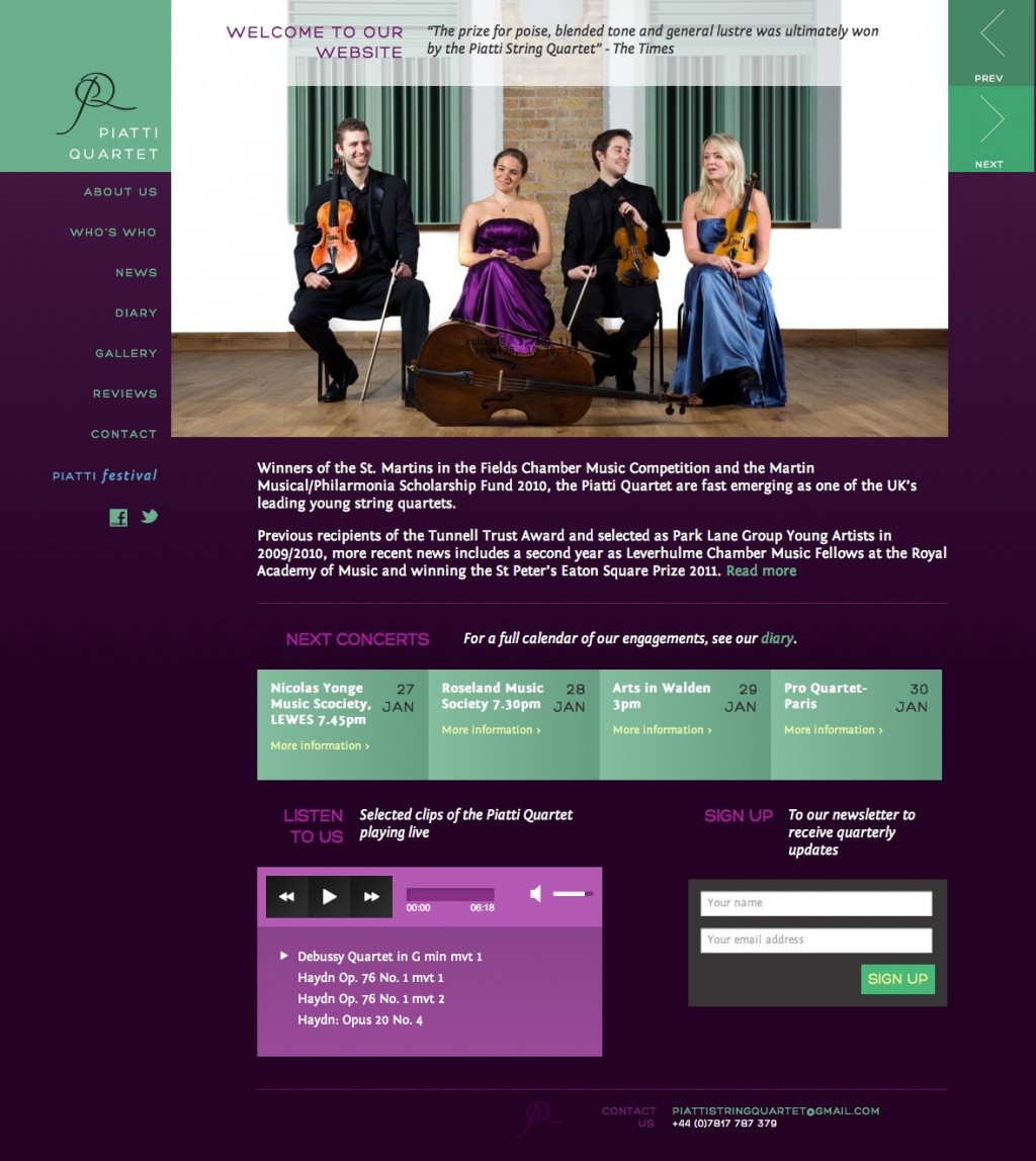
The Piatti Quartet approached us having seen some of our other sites for musicians (such as the Badke Quartet and Simon Lane). They already had a website but asked us to create something much more visually striking, which adequately reflected their passion and perfectionism.
What we did
Crafting the design
We worked hard to create an aesthetic that would impress and delight both Piatti themselves and their followers. Taking a cue from the photos they supplied to use on the site, we created a regal colour scheme based on rich purples and greens, with white and black text lending extra contrast, while a strict grid underpinning the page layouts lends authority and conviction to the content.
We also worked carefully on typography, selecting fonts that could convey a combination of classical and modern befitting this young, dynamic group. Body text is set in Fontin, with its very subtle (and therefore not too stuffy) serifs, while titles and menus are in the clean, wide, confident sans-serif Hero, and all in caps, its long straight lines helping to complement and emphasise the underlying grid of the layout.