Imatik name and brand identity
Automate Images GmbH made a wardrobe-sized product photography system called “Shoedex”. You can guess which sector it targeted. But when the company was bought, the new owners (long-standing clients and friends of ours, Orbitvu) saw the potential to move into other industries, and felt a new name was essential. The company’s own name was the best source of inspiration, and so Image + Automatic became Imatik, a word that was available as a .com domain, had few search results, was short and easy to spell / dictate, and posed no significant problems in pronunciation in the European target markets.
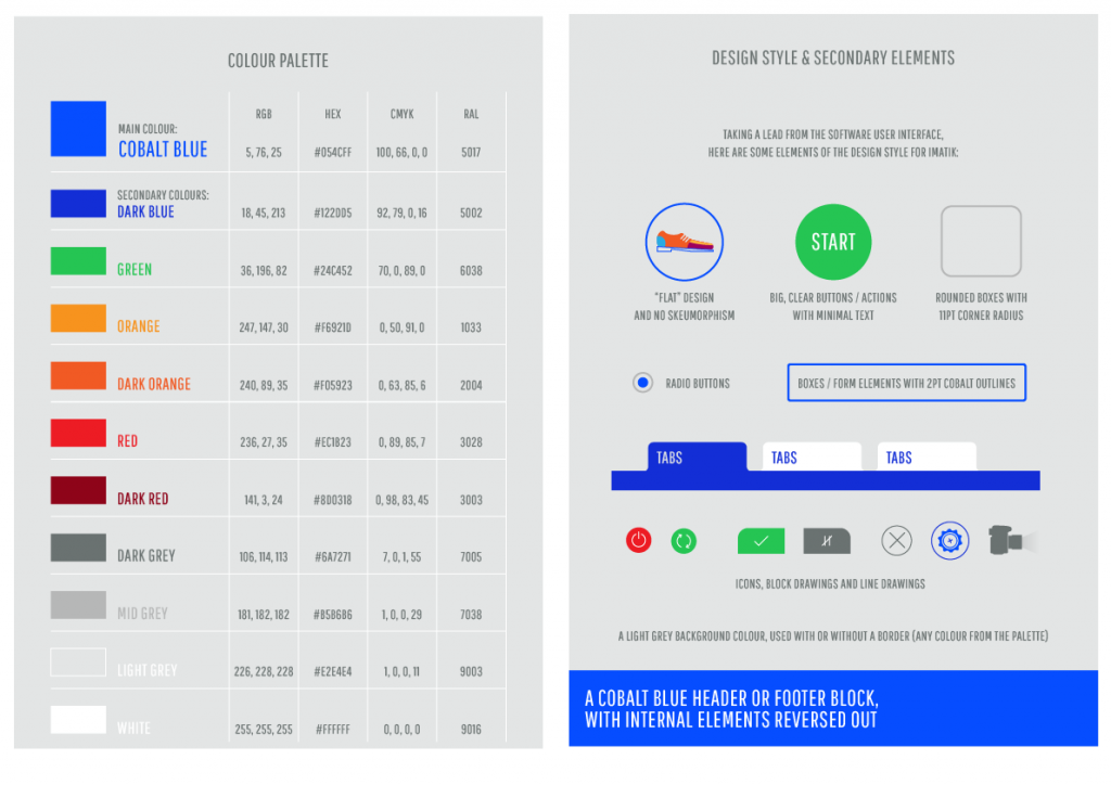
The logo was as hard-edged, geometric and functional as possible, and brand colours and elements were selected to be bold, bright and contemporary.
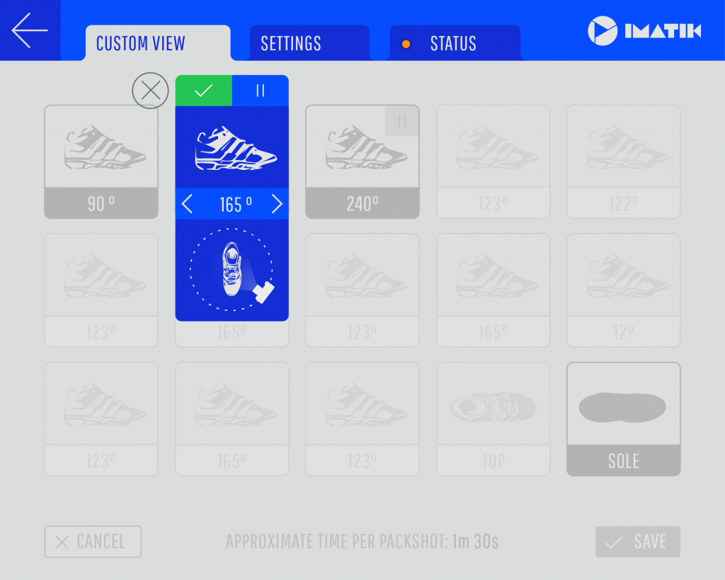
Imatik user interface
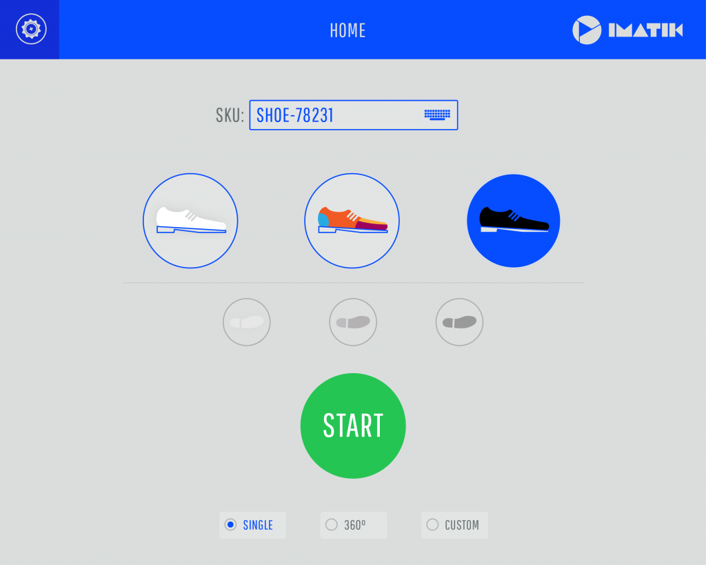
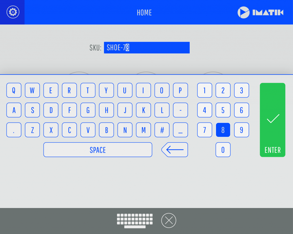
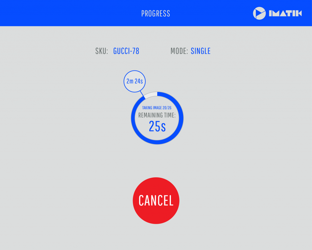
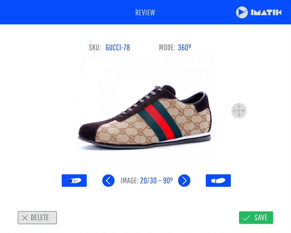
The principal selling point of the system is that it takes very little technical or photographic training to use on a day-to-day basis; most of the time, the operator only needs to place the next product, enter its SKU / code and then press the UI’s big green button. So the aim of the interface was to allow access to more settings and options, but not at the expense of the impression of simplicity.