

The brief
Clink’s London accommodation (at Clink78 and Clink261 hostels) is aimed at independent travellers, backpackers and youth groups. Clink doesn’t try to attract party-goers or clubbers, but aims to bring in more culturally curious guests. Nevertheless, their UK target is predominantly young, and predominantly on a budget.
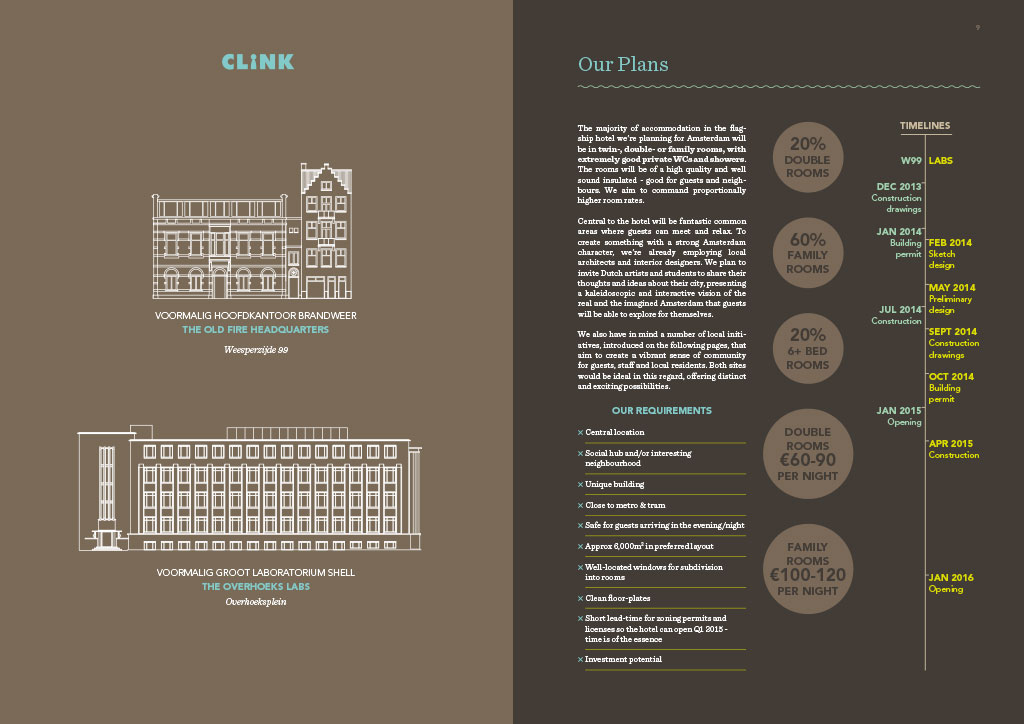
Seeking to expand to mainland Europe, Clink wanted to create a flagship hotel/hostel hybrid that would position them slightly higher up the ladder, without forgoing the individuality and character that has made them so successful.
They had already been granted a striking ex-fire service HQ building in a largely residential area of Amsterdam, only to meet rabid (my opinion, not theirs) opposition from the neighbours, who seemed to fear some kind of drugged-and-drunken-squat-of-vice-and-poor-bicycle-etiquette. To be fair, most youth hostels in Amsterdam do pitch squarely at young male guests visiting Amsterdam for a jazz woodbine and a gawp at a red-lit sex worker or two. But a cursory glance at Clink’s website or owners would have made it obvious (again, in my opinion) that this was not going to be Clink’s target market. In a meeting with the building’s neighbours, Clink’s extremely personable directors had been shouted down from the start, and given no chance to enter any kind of dialogue, so they needed to find another way of presenting their case. A brochure. Urgently.
TL;DR – Clink asked us to produce a brochure that would explain to the Mayor, council and citizens exactly what the company had in mind for a new accommodation premises in Amsterdam, and why it was a good idea for the city as well.
What we did
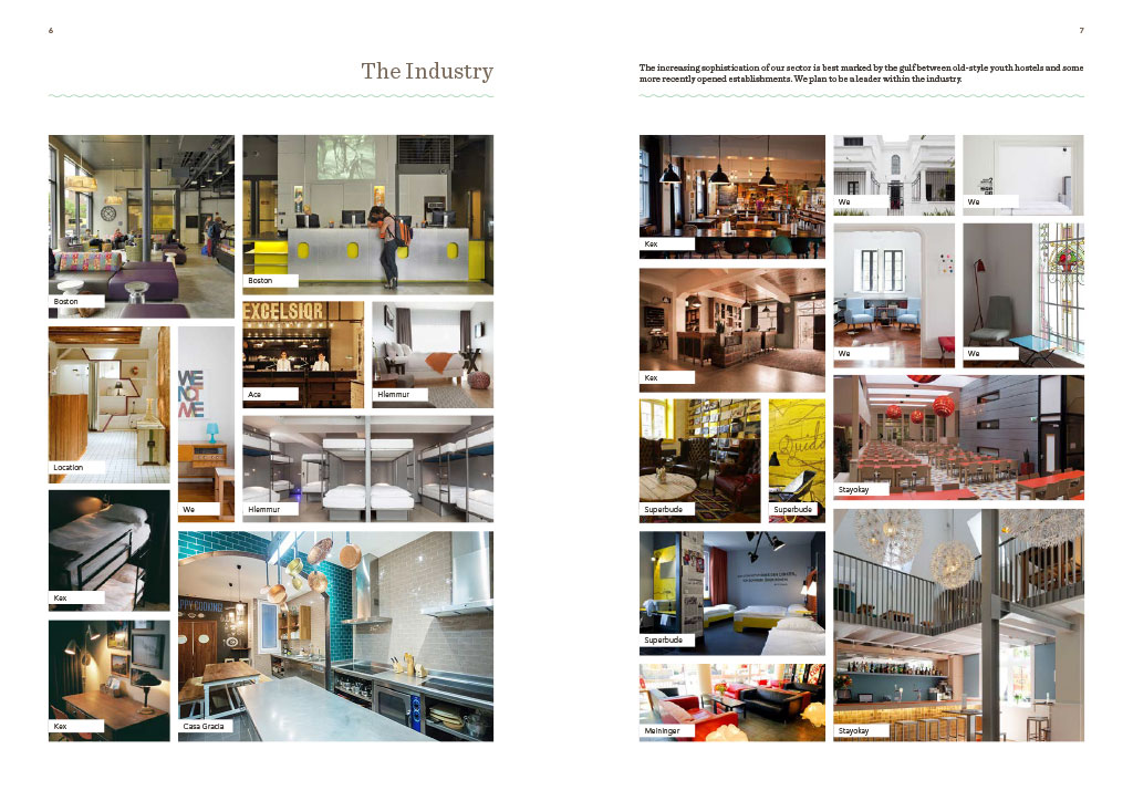
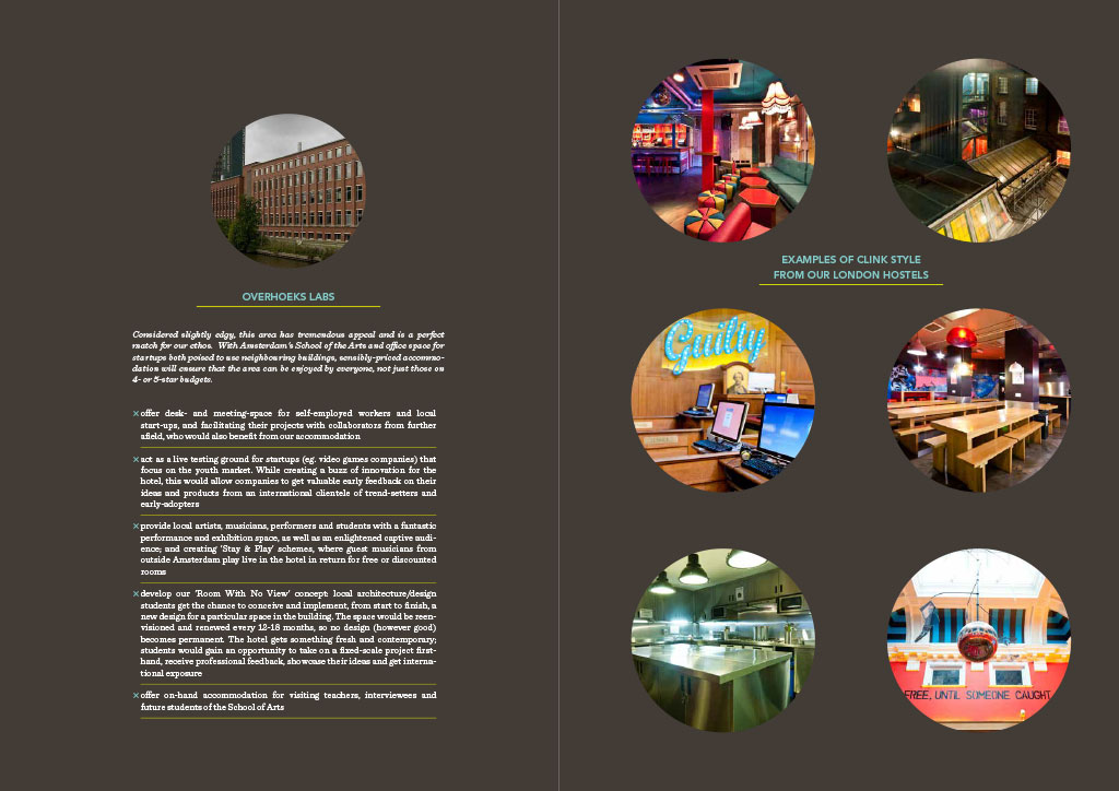
We produced a brochure that tried to do the above, and also took a first step towards extending Clink’s up-to-now jovial, humorous brand into slightly higher-end territory, with more sober (yet still vibrant) colours, none of the cartoony characters, and toned-down fonts. We also found a EN-NL translator to create a Dutch version of the document text over a weekend, and then collaborated with Clink’s Amsterdam-based project management company to fine-tune the brochure to its target audience.