The brief
We started with an email that said “I was wondering if you could work on something for us as a matter of urgency… What I would like is advice on what to call our new hostel.” A year and a half later, Clink has become one of our biggest, most consistent and friendliest clients, and working on projects for them we’ve collaborated with some of London’s best interior designers, helped to define the corporate identity and style to be followed by other designers working for Clink, created much of their print advertising, drawn scores of little characters, and we’re now redesigning their website and working on other ongoing commissions.
What we did
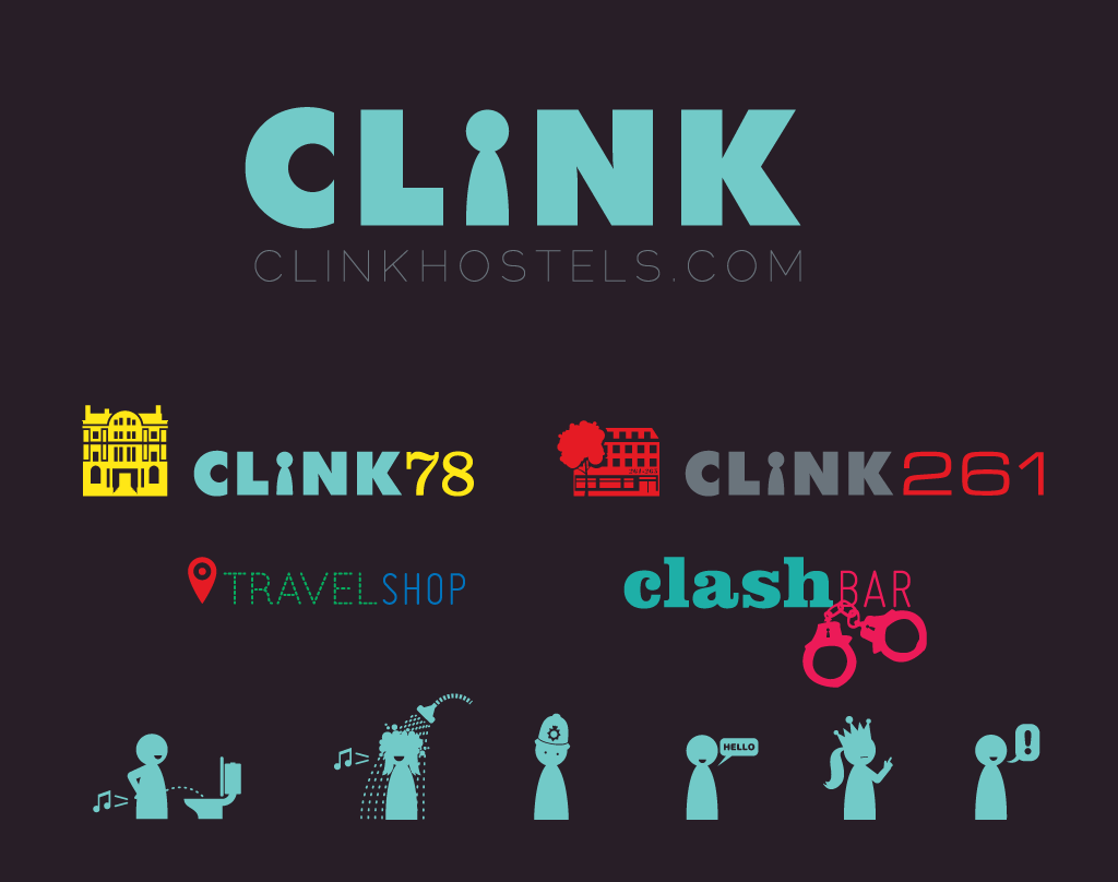
Adjusting the logo
Oddly enough, our initial naming advice probably wasn’t quite on the mark, but there must have been something in our approach or attitude that inspired Anne, Nicky, Berengère and Kristine (respectively the owner, marketing manager and the two hostel managers) to work with us again. Our first “proper” job was to adjust and extend the existing Clink logo: it was lowercase, in a heavy weight of Akzidenz Grotesk (as we noted at the time, “Akzidenz is a lovely font, but the letters c, l, n and k in Akzidenz Super are very similar to dull old Arial Black”), with a clever custom “i” made up of a little keyhole shape that also looked like a board game figurine, affectionately called “Eric”. When we got our hands on the logo, we changed the font to a modified uppercase Futura, because uppercase letters created a neater block shape for the logo. We adjusted each letter’s vectors by hand to regulate widths and customise characters (removing the capital C’s sharp, extending points, for example).
For the sub-logos for the individual hostels Clink78 and Clink261, the revised wordmark worked well with fonts chosen to distinguish the numbers and to represent the architectural period and something of the spirit of the buildings themselves (hence Clarendon for an old courthouse, and Eurostile for a 20th Century office block). We also designed a variable logo for Clink’s internal Travelshop (selling backpackers’ essentials and tickets for London attractions) and the buzzing in-house late-licence bar, which we helped rename from clinkbar to clashbar – mainly because a clash is louder and probably more fun than a polite little clink. And also because the bar manager was keen to capitalise on the hostel’s connections with London punks The Clash, who had been on trial in the building back when it was still a magistrates court.
Eric (and Erica)
The keyhole/boardgame “Eric” character was a real asset to Clink, and something that had already been used to great effect on a range of material. We suggested creating a companion “Erica” piece, and making both of them much more expressive while still simple and elemental. We have since created a wide-ranging and articulated host of irreverent characters; farting, stealing, getting cross, reigning, laughing, sleepwalking, singing in the shower and forgetting to put the toilet seat down.
Advertising
The irreverence has also continued across print adverts placed in TimeOut, The Student Guide, Festival Guide, What’s On and more. In ads, we’ve generally mixed photographic and illustration elements, and each ad has been tailored to the target publication.
Signage
We started work on wayfinding, facilities maps and signage for the smaller of the two hostels, Clink261, with a mere 200 beds, and we defined the overall style and subsequently the individual artwork for all internal signs, maps and odd decorative elements. We’re now working on extending the initial work to the much more complicated 700-bed Clink78.
Brochures, award submissions and presentations
When Clink went in for the BT London tourism awards with four or five days to go before the deadline and during the summer holidays, we all talked about producing a magazine-format submission that described what made Clink special in a lively, manageable format. However, neither Clink nor we expected that it would mean producing, from scratch, an 72-page brochure in InDesign, with most pages following completely distinct designs and lots of new illustrations and photographs, all in 3 days.
We capitalised on that surge of rush work a few weeks later when we re-purposed the brochure (and added another 10 pages) for another award submission, and then also used the resources as a basis for an interactive PDF presentation to be given to visitors to Clink’s stand at the WYSTC tourism trade fair in Beijing. Interactive PDF was chosen (over html5, Flash, Powerpoint or similar) to ensure that the presentation could be shown simply to visitors on a laptop, viewed by them on their own computers with widely available plugins, or printed out neatly, and all starting from a program (InDesign) that made designing and styling the document as painless as possible.
A note about our general approach to design work for Clink
Clink projects have differed from many other clients’ work because they’re so varied, covering print, web, merchandise, interiors and signage, and more besides, and often in two or more different brand colourschemes. They’re also produced to tight deadlines and generally tight budgets, by us at Yes We Work and by several other design agencies and freelancers. As a result, we’ve helped Clink build up an arsenal of custom-drawn, resolution-independent vector graphics that they can also make available to other designers, allowing elements to be easily reused for the sake of consistency and speed.