The brief
We had previously designed a rudimentary site for DS FIT when they started out, but after a couple of years of successful business they came back to us to design and build a new version. It needed to present key information (list of services and prices, trainer profiles and qualifications, map of areas covered), but crucially, convey the friendly, personable nature of the company and the team.
What we did
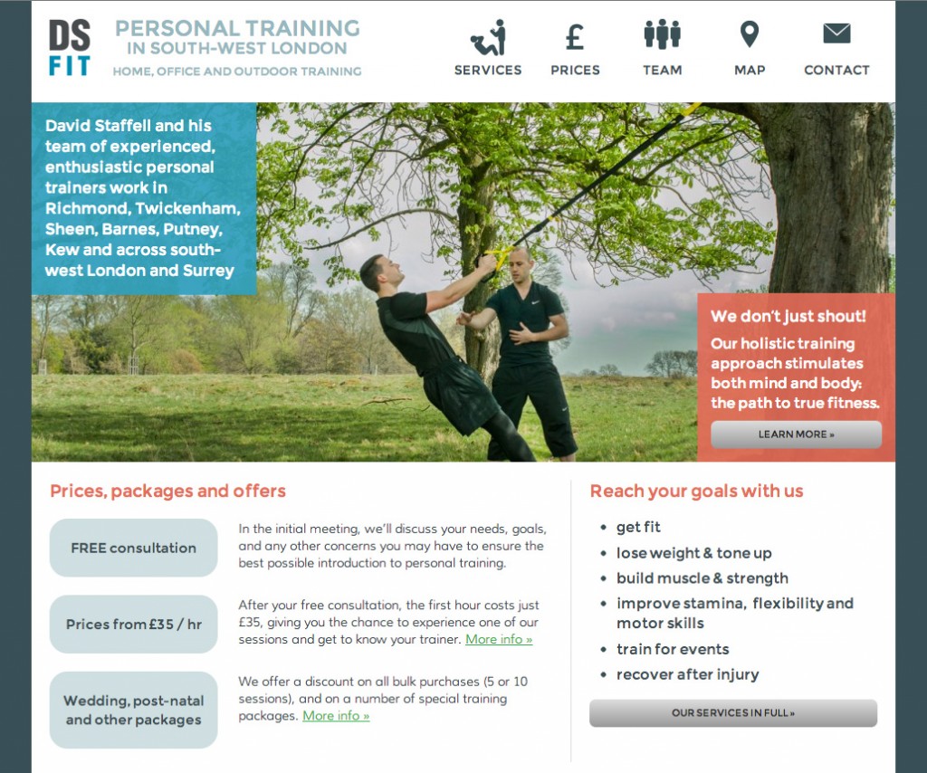
Firstly, we helped coordinate a photoshoot with a professional photographer, so that the site could be illustrated with authentic images of trainers, clients and equipment, so users would have an instant sense of who they would be working with, and the kinds of settings and activities offered.
We then carefully chose design elements that would help convey the right company image, including friendly (but not childish) typefaces and icons, and we used the colours of DS FIT’s existing branding as a basis for the site’s colour scheme. We carefully structured the available information to make the site easy to scan and to make it easy for users to find their way to what they need.
On the homepage, a photo slideshow, a list of fitness objectives, a selection of the best-value deals and packages, and a welcoming paragraph about the DS FIT approach (“we don’t just shout!”), present a series of varied calls to action aimed to entice the potential customer. Beyond that, other pages maintain the appeal through their simplicity of structure and clean, elegant design.
We paid special attention to search-engine optimisation on this site, since web searches are the company’s principal source of new business. We made sure all of the site’s underlying code was semantically structured and contained just the right quantity of relevant keywords, and advised on ways of improving rankings. Our efforts have been extremely successful, and the site now ranks first in Google for the most relevant queries, including several variations on ‘personal trainer Richmond’