The brief
Catalan architects JEEV (led by the eponymous Joan Enric Ejarque Velázquez) needed a new site to replace their ageing Flash site. Their key requirements were to maintain consistency with the existing corporate image, to present a well-organised portfolio showing photographs and renders of their projects to best visual effect, and cross-platform compatibility, including iOS devices.
What we did
Winning the pitch
We were recommended to JEEV by a friend who knew our work, but when we sent over a few examples from our portfolio, the reaction was icy, and nor did they mince their words, telling us straight up that they didn’t like what we’d sent them. (At least their honesty saved time: British clients, in our experience, would have made the same point in a far more tortuous way.) We initially assumed that was the end of that, and promptly shunted it to our ‘ones that got away’ list. But we did also ask – both out of pure curiosity, and in a general spirit of self-improvement – for some examples of the sort of design they’d been looking for. After digging a bit deeper, we began to suspect that the biggest issue with the examples we’d sent was simply that they didn’t have much to do with architecture or interior design, and were consequently hard for them to relate to. Though we hadn’t designed a website for architects before, we had hoped they’d appreciate the variety, flexibility and suitability of our design work across many different sectors. On further reflection, we were so confident that we could deliver a design that would satisfy them that we – exceptionally – offered a no-compromise design proposal. It was a strategy that worked: when we signed off several months later, Joan Enric was as concise as ever: he told us the site was ‘perfect’.
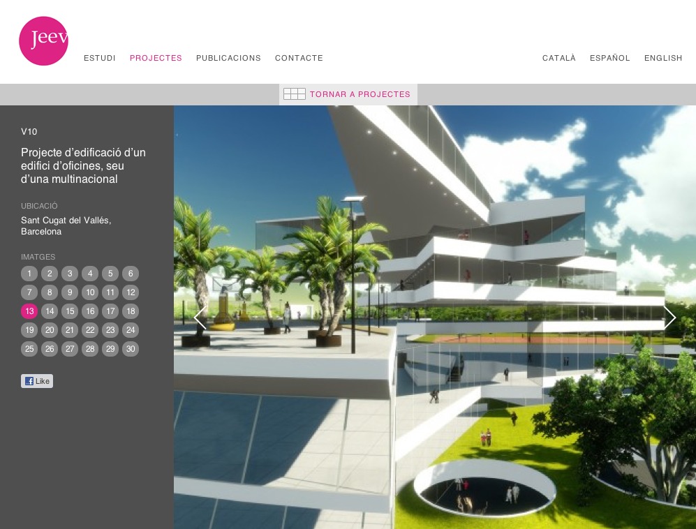
Maximising visual impact with responsive design
The core of the site is a portfolio section whose design adapts to fill all the available space in the user’s browser, allowing us to maximise the impact of the impressive photographs and renders of the projects. An initial grid view shows a grid of project thumbnails; from this grid individual project information and galleries can be accessed. A system of dynamic filters allows the projects grid to be browsed without reloading the page, and users can browse back and forth between the grid and projects without losing their place.
Multilingual content management
All content was supplied in three languages, so we used the qTranslate plugin for WordPress, extended to the custom data structure we created for the site, to manage the multiple versions. The result is a system that’s effortless to manage for the client, while the visitor to the site can switch language with a single click from the language navigation visible on all pages.