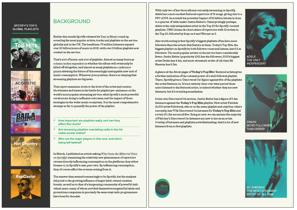
background
Chris Price, the new (as of March 2016) Head of Music at BBC Radio1, previously consulted to international radio and digital companies under the name New Slang Media, and – in collaboration with Rich Oakley – did some fascinating and timely research into the crossover of influence between the classically curatorial music programming for presenter radio and the data-driven playlists and “up next…” algorithms behind many on-line streaming services. He asked if we could quickly (over a weekend) design two Listomania reports he was writing that dealt specifically with the power of Spotify playlists to create new hits or reinforce the status quo of already-popular artists. As it happened, his findings were also set to shape music discovery policy at Radio1, which means the reports he wrote have been picked up by UK newspapers and even alluded to on Radio4’s Today Programme.
our work
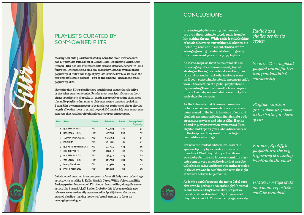
We took slight licence, and read Spotify’s brand manual before embarking on the designs of the reports, and then merged some of their style into New Slang Media’s own house style (which we had developed several years previously, along with the logo)… after all, if the point of Chris’ research was to show that the streaming giant was influencing other players, it only seemed right for it to influence us too. We love (and subscribe to) Spotify anyway, so to be able to pay homage to elements of its UI and ID was an honour.
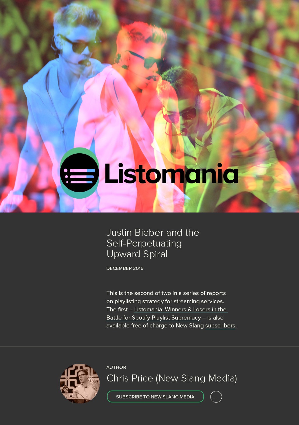
We were careful to use CC images for the reports and credit the photographers prominently on the reports’ covers. For the first report into Spotify-owned vs. label-curated playlists, we echoed Spotify’s house style of duotone image processing, while for the second report into the circumstances that led Justin Bieber to have 3 songs in the top 5 of the UK Singles Chart at the same time (don’t even get me started on what that means about The Modern World and the Youth Of Today), in key points we used 3 overlaid images, each a duotone leaning towards red, green and blue respectively.
charts and tables
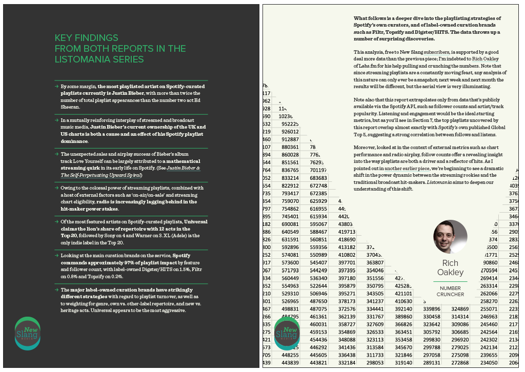
There’s nothing… literally nothing… we love as passionately as copying a chart from Excel and pasting it into Illustrator; something about the way all text labels, axis markings, legends and data points are turned into mumbo-jumbo strings of characters is just so delightful, and the fact that long chart lines become tiny fragments never fails to lift the heart. For this report, we prettified a couple of charts, which Chris then asked us to adapt for a presentation on the future of music discovery policy when he got to Radio1.
for the record
Chris has been a friend since our school days in the 80s… it’s amazing to be able to chart someone’s professional rise so closely, and see them get exactly where they hoped they would, exactly as they said they probably ought to, pretty much exactly on time. He should run the trains, etc, etc…