recipe section
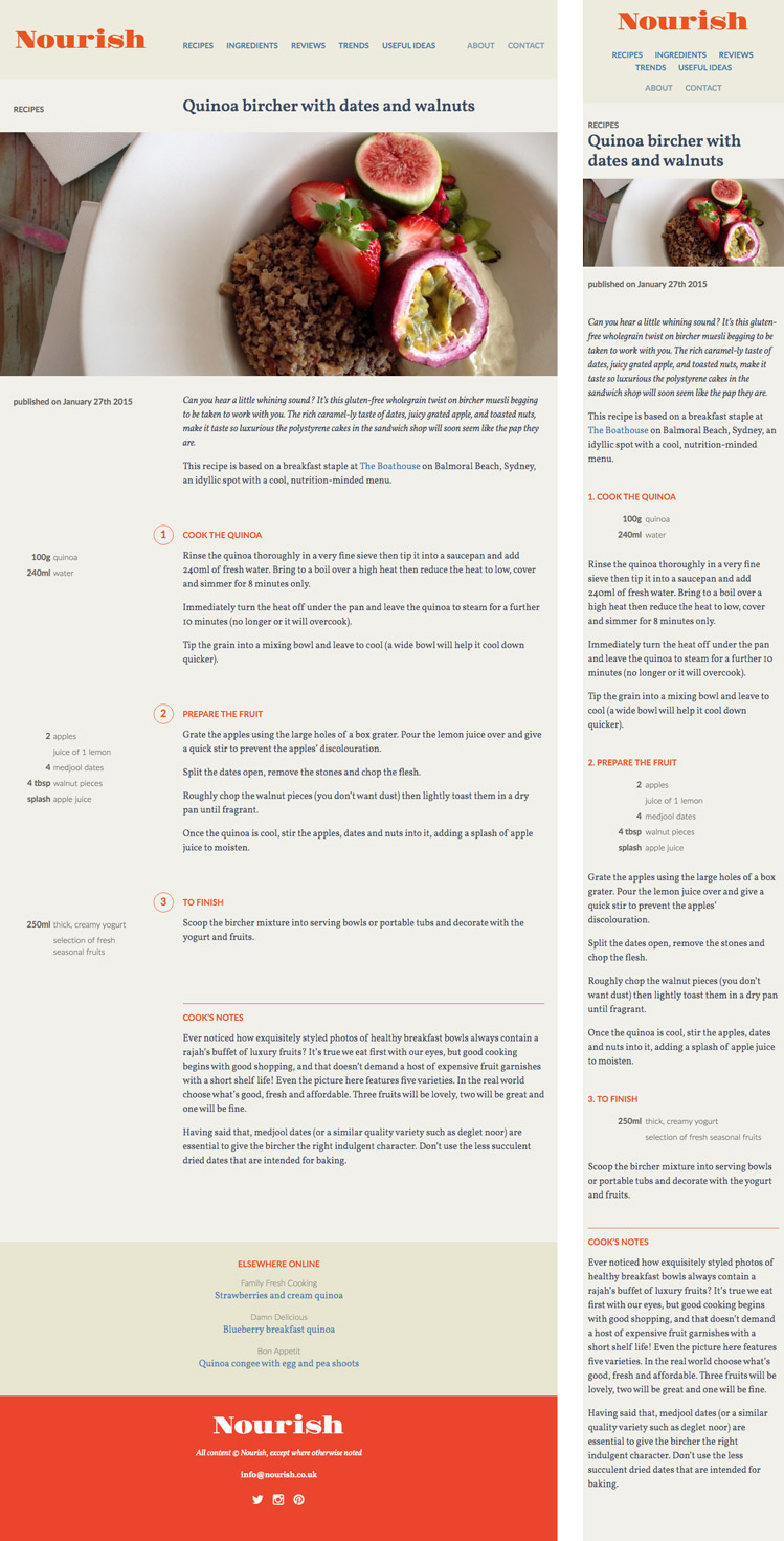
We’re both keen cooks, so it was a pleasure to work on a site that allowed us to address a few gripes we had with trying to use recipes on-screen in the kitchen. The last thing you want to do with your expensive new tablet / phone / laptop is smear oily, wet or floury fingers all over it as you try to scroll, zoom and tap between ingredients and method sections of the page to see what you need to add to the spitting wok or steamy pan. On Nourish, we interlaced the ingredients and the method so that you could easily see what you need (and what to do) at each stage of the process. At desktop and tablet sizes, ingredients are on the left, method on the right; on smaller screens, each step’s ingredients precede the method in a single vertical flow. At most, all you need to do is use your one clean knuckle (or your nose at a push) to scroll.
