The brief
“The 18th Century meets the 21st”. Logo, visual identity and website required. Top priorities: publicise events and sell tickets.
What we did
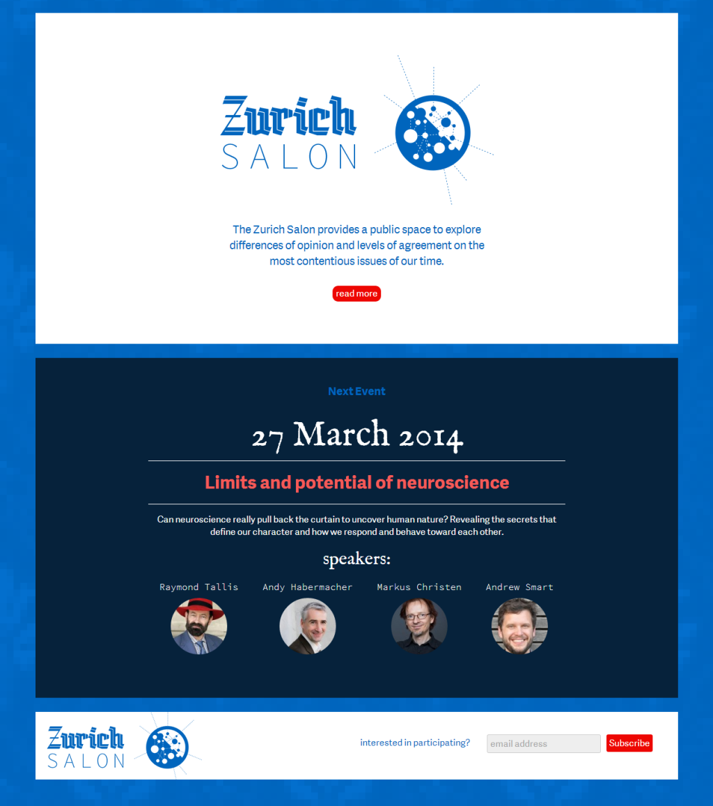
The logo was designed with several ideas in mind. The containing circle represents the format of meetings that Zurich Salon’s founders wish to organise – not a ‘top table’ of speakers and a plateau of audience members, but a more democratic discussion ‘in the round’; within the outer circle, smaller circles represent participants and audience members, having more or less of a voice or an opinion. Connecting lines suggest dialogue and transmission of ideas, while interior-exterior dotted lines suggest influence on the Salon from the outside world as well as an extension of ideas elaborated at Salon meetings out into participants’ lives. The diagonal division of blue and white echoes Zurich’s coat of arms. And yes, it DOES look like Sputnik. OR a petri-dish culture. Or a GO-like game. Or an LHC experiment. Doesn’t it?
We then designed three alternate, differently detailed versions of the logo to ensure clarity at different sizes.
The website was designed to carry the same messages as the logo, with contrasting fonts used to suggest a meeting of ideas and historical eras. Our current favourite Adelle Sans is the body font – “a cleaner and more spirited take on the traditional grotesque sans”; IM Fell English, digitized from a 1672 sample, is used for dates, quotes and occasional titles; Adobe’s IDE-targetting monospaced Source Code Pro adds a drily technical edge to biographies and names.