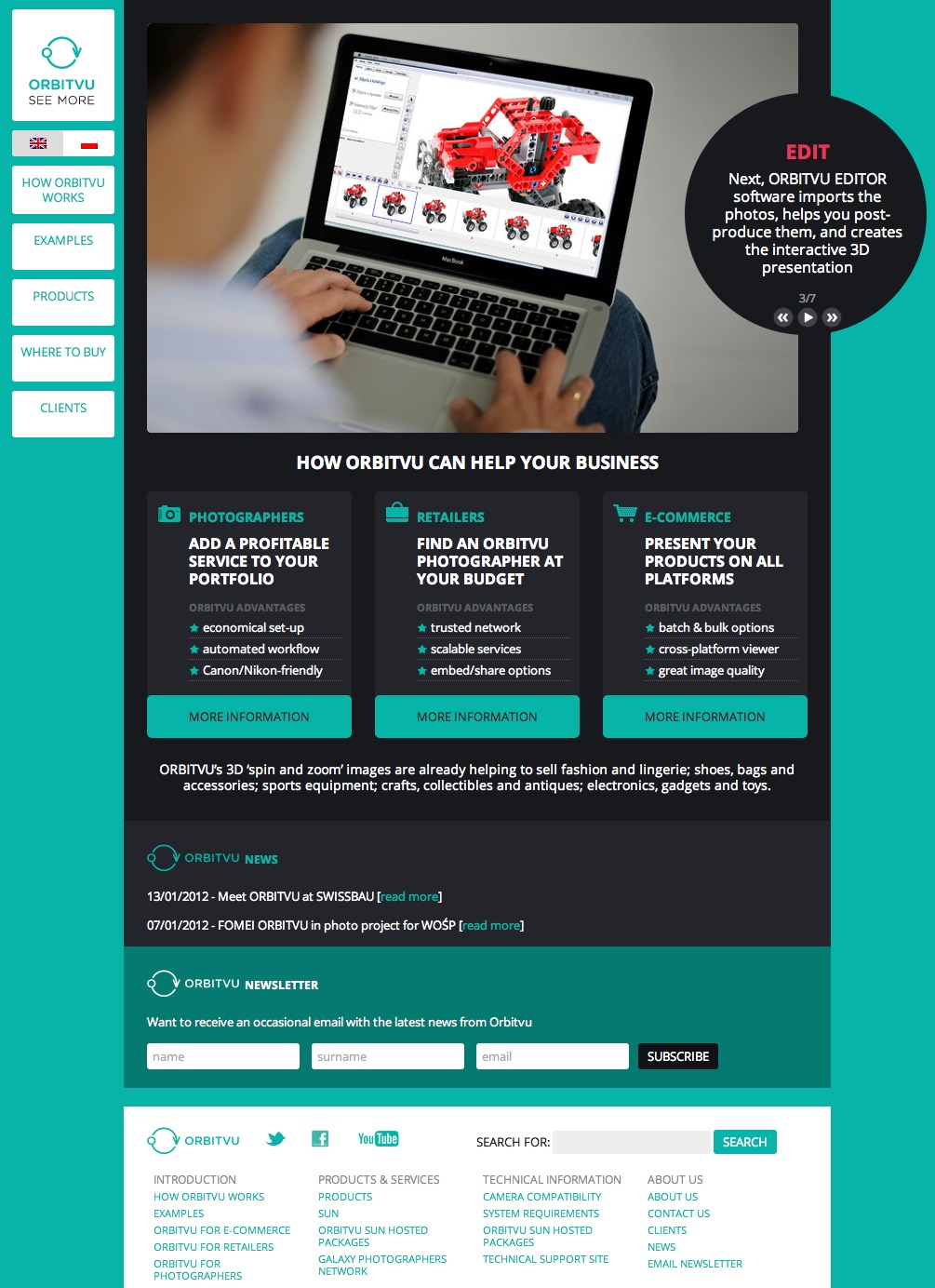
The brief
We were asked to redesign the product website for OrbitVu, a technology (designed and built by Polish company Ventis) which uses custom-built hardware and software to capture and produce 360º rotating packshots which can be used by retailers to show products in detail online. Aside from the inherent requirement of supplying a striking and appealing design, the main challenge was to present the information – both about how the technology works, and about all the available components and combinations (kits) – in an intuitive, user-friendly and quickly digestible way. The complexities of the system mean that there is a risk of bewildering the user – indeed, even we were initially confused about certain aspects of the system, and how its different elements combine.
What we did
Making it clear for customers
OrbitVu is a system with many parts: hardware, offline software, online software, plus a related service (Galaxy) allowing retailers to find photographers who work with the technology. What’s more, the products are available to users as kits which include different combinations of hardware and software (to cater for different product requirements), but also separately: the software can be used with different hardware, and individual components can be purchased outside of kits. Furthermore, the hosted software is available either for a client’s own server, or hosted on OrbitVu’s servers and licensed via subscription.
To make sure that the content was easily intelligible, we decided that very first content the user sees on the homepage should be a short presentation explaining what OrbitVu does and how its various stages relate to the products available. We also added a ‘how it works’ tab as the first item in the main menu, for users to get a little more detail. Then, in presenting the products and product kits themselves, we worked carefully on the hierarchy of information, using bold headers to separate and group relevant information, and well-labelled cross-links to show how components fit into kits.