the brief
There wasn’t one, as such. This was a self-initiated project back at the beginning of Yes We Work… a friend was going to meet with Spidi at their Italian headquarters and said “if you do a design for their website, I’ll pitch it to them” and since spidi.com at the time was pretty poor (flash, loads of corny animations of airlock doors hissing shut, no clear product section, inward-looking text, tiny images, etc, etc) we thought “yeah, why not?”
what we did
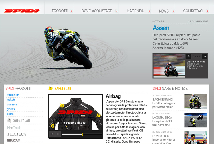
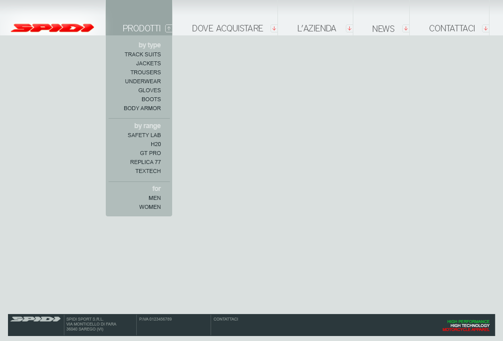
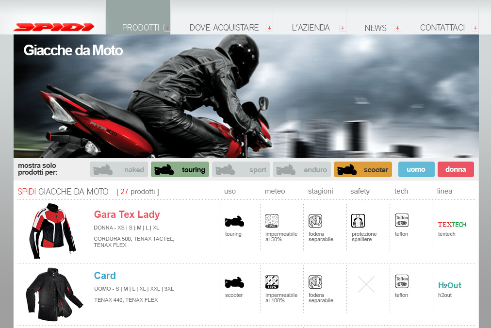
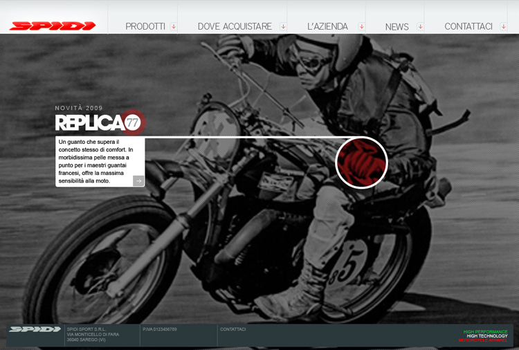
We looked at how we could add taxonomies and navigational structures in order to make sense of their product range (motorbike clothing and safety equipment) yet allow plenty of space for the emotional side of motorcycling, both past and present. And we tried to bring Spidi’s web design up to the same level as their clothing design. All in Italian.


We didn’t get the job. Ho-hum.