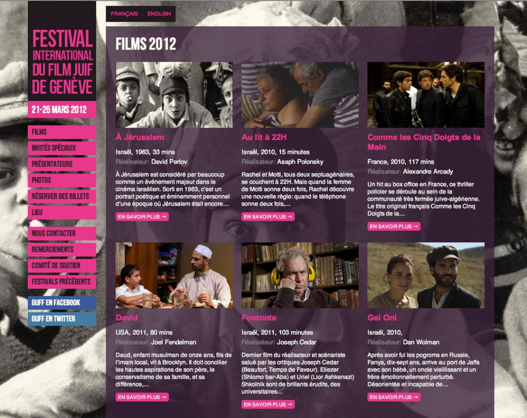
The brief
The UK Jewish Film Festival organised a spin-off festival in Geneva, and needed a logo and website, which had to be independent yet consistent with the existing UK identity and style. The Geneva International Jewish Film Festival website needed a directory of the films being screened, a calendar of screening times that also showed information about extra events taking place alongside the films, plus information about special guest appearances. And all content needed to be managed in two languages, and subsequent years’ festivals would also need to be easily distinguished.
What we did
Logo and palette
We were asked to take the lead for our work from the UKJFF‘s existing logotype which stacks a weathered typeface on three equal-width decks. From a variety of proposals, ranging from weathered (like the original) to extremely rational and clean, a new typeface was chosen – the choice guided by both aesthetics (the clean lines of Swiss design, perhaps?) and practicality (the font – Bebas Neue – is licensed for free use on the web). Stacking the five words luckily gave a logical and clear emphasis to each word: ‘film’ largest, then ‘Geneva’ and ‘Jewish’ – helping distinguish the unique theme of this festival from others at a glance. The GIJFF colour palette gives a similar slight nod to the original purples of UKJFF.
Website: user-experience and attention to detail
We kept a close eye on the existing UKJFF site so as not to stray too far from it visually, adapting a few specific ideas such as the use of large, full-browser background images, which give atmosphere and context. Beyond that, however, we worked hard to improve on several aspects of the user experience. For example, given that the festival takes place over a period of only a few days in a particular month, we felt it made much more sense to present a list of the events instead of a calendar showing events around the current date, which would be empty for 11 months of the year. We also thought hard about the most user-friendly and intuitive ways of linking the different kind of content together (films, screenings, special events and guest appearances and biographies).
Intuitive content-management
In particular we were asked to ensure that the content-management process was as straightforward as possible; the client recounted having had bad experiences in the past, both from a technical perspective (clunky, unintuitive software) and a logistical one (other agencies’ proprietary content-management systems made it difficult to involve new providers, upgrade or move on without prohibitive costs). As firm believers in using open-source software for precisely these reasons, we used WordPress, programming a bespoke theme which allows independent management of each of the different kinds of content, and making use of a couple of specially chosen plugins to define the relationships between them, and to allow all the content to be defined in two languages.
Speed, efficiency and a personal touch: the small team benefits
We had only a few weeks to fully design and develop the site. That we delivered on time is a testament to the efficiency and good communication that a small agency can deliver. Dealing directly with the client and dividing the workload between only two people saves us from the wasted time that might otherwise