The brief
Rose wanted to develop a website that she could use to post information about her ongoing research, including some photography, and as a place to maintain a bibliography of her publications, to list the courses she has taught and offers, and more generally as a kind of modern calling card.
What we did
Information architecture: what goes where?
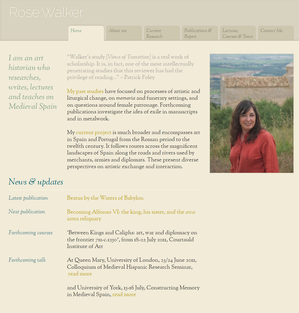
Rose’s work and output are diverse, covering research, writing, teaching, consultancy and management. She was unclear about how this mixture might best be represented on the site, about how these different areas should be featured and how organised in relation to one another. We always take a keen interest in content and structure – or so-called information architecture – even before the design phase, so we worked with Rose on how to organise the material before starting on design mockups. In the process it was decided that the emphasis should be on the academic side of her work, so that the consultancy and management aspects probably didn’t need more than a passing mention on a biography page.
User-experience: the devil’s in the detail
With the remaining material, we made recommendations about how it should be titled and arranged to make it easy for readers to browse through the site. For example, Rose wanted to feature a page about her current research project – provisionally entitled ‘From Romans to Romanesque’ – prominently, as an option in the main menu. This would potentially sit alongside ‘Publications & Papers’ and ‘Lectures, Courses & Tours’. We suggested that instead of labelling the research project by its name in the menu, a title of ‘Current Research’ would make it much clearer to users how it related to the other sections. These and other details led us to a neat, elegant and easy to use final site.
Making appropriate design choices
When preparing the visuals, we chose colours that would sit well with the photography taken for Rose by John Batten. We chose a web-licsensed serif font (OFL Sorts Mill Goudy TT) with just a hint of academic gravitas, but nonetheless clean and light and totally presentable in a modern design. A secondary nod to academia is in the main menu’s tab design. Overall the look is minimal, with the emphasis on typography, legibility and a few images.
Easy content-management
The site is built as a custom WordPress template, permitting Rose to update text and images without special technical knowledge, in particular thanks to a few programming tricks.