The brief
Clio Whittaker set up Ampersand Learning to offer extra-curricular courses and workshops to inner-city schools where primary-age pupils’ learning was suffering because communication between parents and teachers was coming at children’s issues from very different angles. She had decided to turn Ampersand from a side project into her full-time job, and wanted us to help her company identity transmit a bit more of her own personal style, restructuring and relaunching her website in time for a marketing drive to target Local Authorities, London schools, Parent Teacher Associations and families.
What we did
Circling around priorities
After a fairly lengthy back-and-forth of initial sketches and concepts, which thankfully helped to focus discussion, it emerged that Ampersand’s identity should reflect specific aspects of Clio’s work in schools: namely, that it wasn’t a finite process with set goals, but rather a continuous, fluid, often informal circling around educational issues that aimed to help smooth communication and understanding between groups and thus launch schoolchildren in the right direction for their future educational success. Ampersand had to give the impression of a comfortable, friendly environment for parents and children; an image of personable yet professional support to fellow teachers; and a sense of being results-focused and able to navigate seas of red-tape to Local Authority staff.
Personality
With these potentially contradictory aims identified, a visit to Ampersand and a look at the teaching resources and work folders Clio produces for and during sessions led quickly to the final proposal: a smooth, bold, hand-painted (&) symbol with a strong upward swoop containing internal interconnecting threads, loops and knots. The symbol was balanced by a a wordmark using Clio’s own elegantly approachable handwriting. Both symbol and wordmark were scanned, converted to vector artwork and fine-tuned by hand.
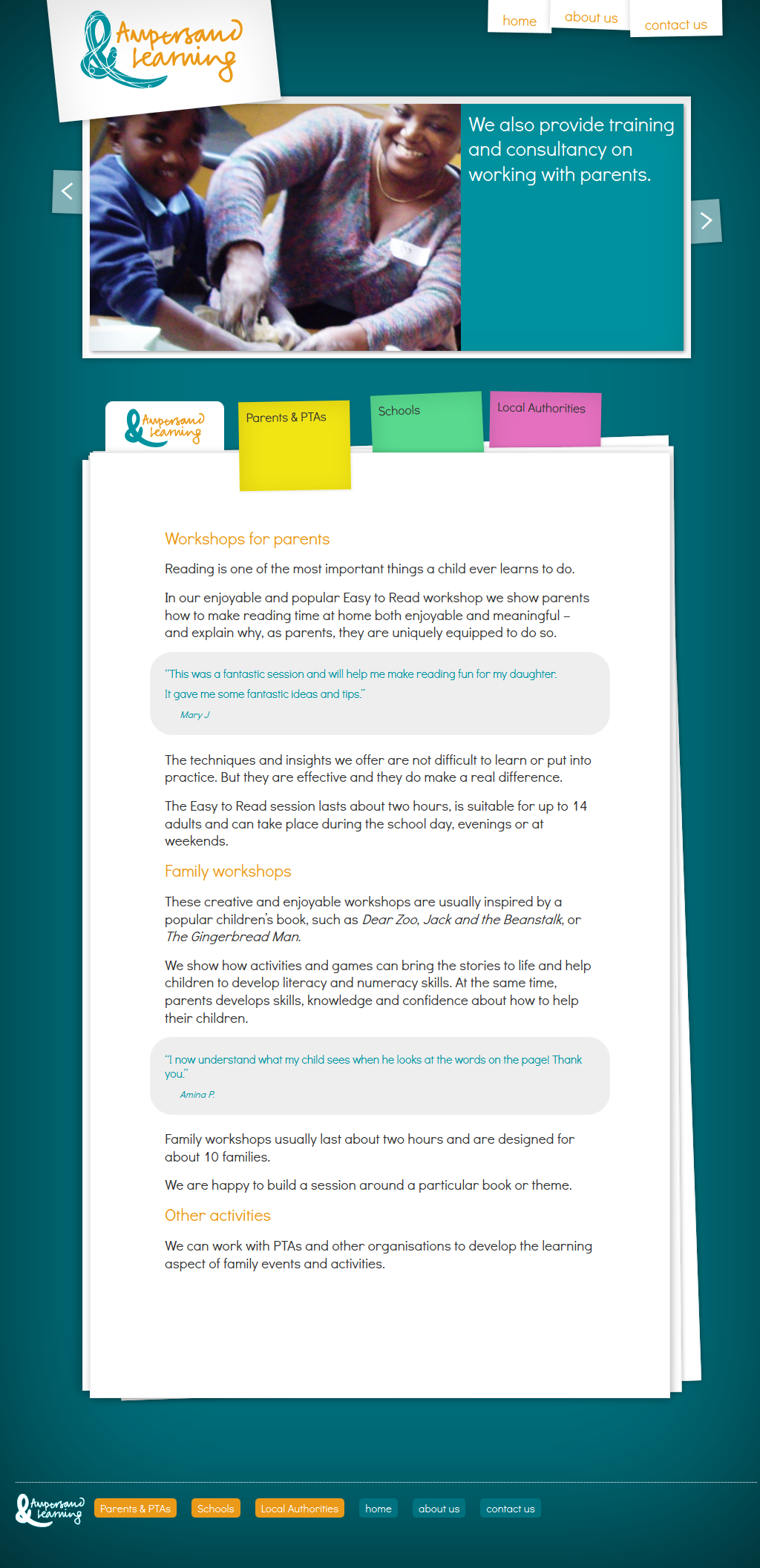
Familiar visual metaphors
For the website, the most immediately relevant style proved to be a visual metaphor familiar to anyone working in teaching and education: for all the proliferation of interactive whiteboards and computers in the modern classroom, a neat (yet loose) folder of stacked pages seemed appropriately organised yet personal, with post-it notes as placeholder navigation items, and informal photos made to look as though they were tangible, mounted on card, held up with tape, like a classroom display on the wall of any happy school. Almost all of this visual effect was created using elegantly degradable css3 applied to semantic html. Elements like the pages and notes show as rotated by a degree or two in modern browsers, but are straight in older ones; subtle background gradients fall back to simple flat colours; web fonts have cross-platform defaults, and so on. AJAX loads page content into the browser without a total refresh, and jQuery helps layout and slideshow features, but non-Javascript browsers can access all content with very little important aesthetic sacrifice.
The practicalities
It was vital that every element we created for Ampersand have practicality at its core: the website’s CMS is easy for Clio to edit and update; while print documents (the letterhead and workshop session plans, for instance) are Word templates that can be edited at any time by Clio herself, so that her company isn’t tied unrealistically and expensively to us for minor modifications or repeat work.