What we did… in reverse chronological order
2013
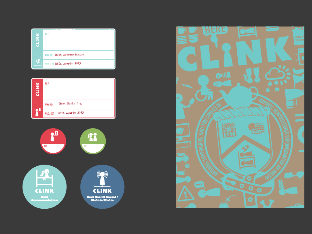
stickers for loose sheets of paper and backing cards for odd small items
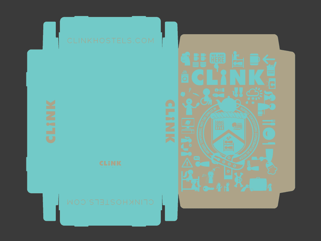
larger-than-A4 box in kraft, overprinted with the Clink design in teal
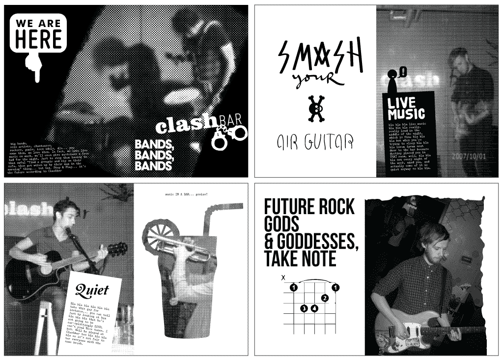
fanzine-style support documentation for the award
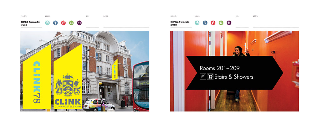
template outline for support documentation
After winning the big award in 2012, submitting again in 2013 was accepted to be a bit of a waste of time… the judges would never give the award to Clink again. Would they? So we pared the application down even further… and as designers we passed the buck to Clink staff, producing a new format in place of the 70-80pp magazine/brochure; this year, we suggested a nice box, containing an A5 booklet of text, cross-references to supporting material on loose sheets, in envelopes, stickered, tied with ribbon, and so on. The idea was to give the judges a childlike Christmas day experience of having loads of tactile and odd-sized, multi-format things to unwrap and discover. And also to allow Clink staff to do more work at the last minute. To everyone’s amazement, it worked, and Clink won the top award for the second year running!
2012
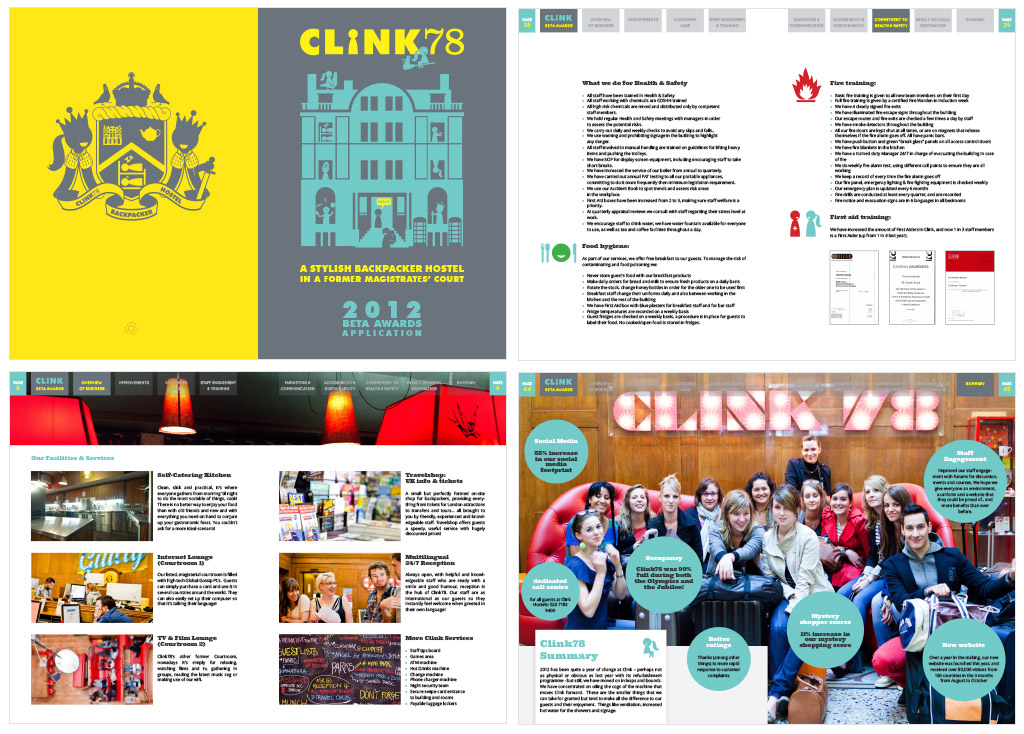
This year saw a less ambitious start – less supporting information for the judges to wade through, shorter texts and in design terms, more full-bleed photos for dramatic effect. It worked. Clink won the coveted Best Accommodation award, which instantly justified any invoice we cared to submit (only joking).
2011
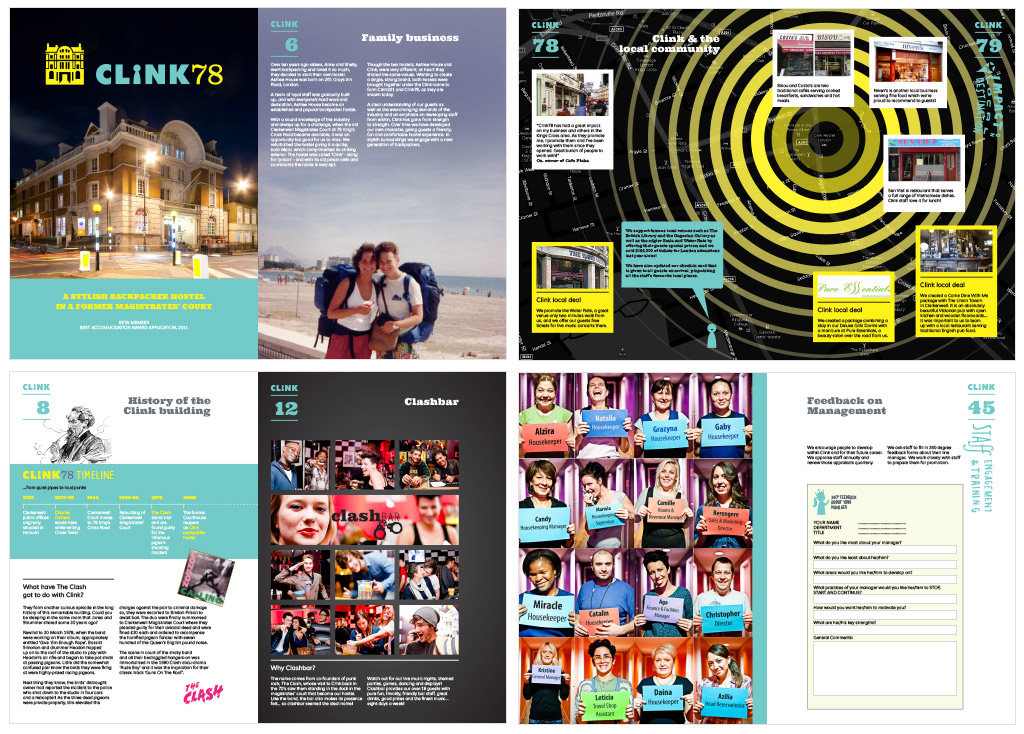
In 2011, it was a miracle anything got done by the deadline… the brochure was done from start to finish in a week, spiralled to 80 pages each with a unique layout, with lots of hand-cut letters photographed, scanned and vectorized (why, dear god? why?), plenty of custom illustration, several layouts within layouts, “infographics”, charts, certificates… this was an entry that threw everything at the wall, to see what stuck. Clink didn’t win.