The brief
FAO – the Food and Agriculture Organisation of the United Nations – needed a distinctive logo for a new initiative monitoring the effectiveness of agricultural policies in African countries. They requested a simple, elegant design that conveyed the main elements of the programme.
How we did it
Our proposals
We poured many initial fruitless hours into thinking on how one might turn the high abstraction of an idea like ‘monitoring the effectiveness of policies’ into an iconic graphic. Failing to come up with any satisfactory answer, we concluded that it was too complex an idea to render simplistically. So, to keep the logo proposals elegant and clean, we focused in most of our proposals on one simple detail or idea, aiming to make the result visually arresting, not necessarily to be read too literally.
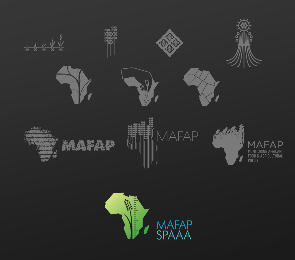
The chosen logo
The final chosen design (of a dozen or so we offered) has an ear of wheat alongside a measuring rule, superimposed on a silhouette of Africa. The symbols reflect the key aspects of the initiative in a basic way: the monitoring, the agriculture, the location.
What we thought
This was one of the designs which – in our view – did ask to be read a bit too literally. And yet the literal reading doesn’t really correspond to the reality of the project, since MAFAP is a much more abstract and hands-off enterprise than the ensemble in the final logo might imply: it’s about measuring policies, not about stepping in and measuring agricultural productivity directly. For that reason (and on purely aesthetic grounds too) we thought that some of the less literal logo proposals – those which picked a single symbol or metaphor rather than trying to cram in all the keywords, so to speak – were more effective. But we were pleased to get a final choice past the bureaucratic machinery at all (believe us, that’s something), and we’re still proud of the result.