The brief
Having already fully designed and developed two sites for Atlantic Productions (namely, The Wildest Dream and First Life, the latter another wildlife doc featuring SDA), they again commissioned us to create the site for their latest and technically most sophisticated doc, Flying Monsters 3D. The film – being shown in IMAX cinemas – recreates a variety of prehistoric winged creatures in photorealistic CGI, and the website needed to show off appealing samples of the impressive video content, plus behind-the-scenes material, and appeal to a variety of interest groups: scientifically-minded adults, big-screen-experience junkies, dinosaur-loving kids.
How we did it
The aesthetic
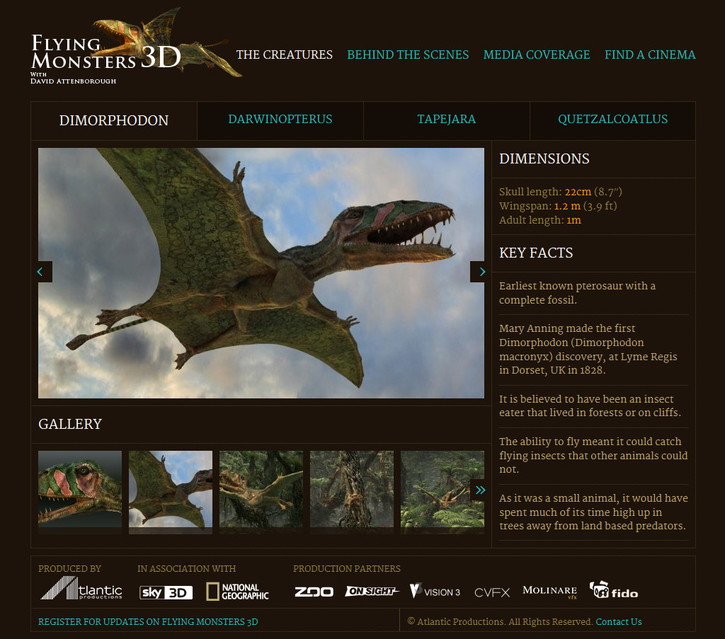
Given the different angles of interest, we pitched the design somewhere between scientific/archeological and more boldly filmic. The initial design concept evolved quickly, inspired by colours from some of the CGI landscapes supplied, along with our conviction that it ought to be at once filmic and scientific. The homepage features big, large elements – the video trailer, the attention-grabbing headline and the pull-quotes from articles, the ‘Experience this in IMAX’ and iPad-app banners – while the inner pages, particularly the creatures page, are slightly more intricate, the boxed, dotted-line structure alluding, perhaps, to an archeologist’s inventory… or at least how we envisaged one looking. Images and clips from the site are presented frequently and prominently throughout the site, complemented by smooth page transitions and interactive elements that help to create a filmic atmosphere.
Optimising the user experience
User experience and information architecture are twin obsessions for us in all our web work, and in developing the FM site on many occasions we made iterative suggestions to the client’s requests in order to make improvements in these areas. For example, where the behind-the-scenes/making-of information for each creature was originally supplied as a ragbag of fragments of CGI screengrabs and short video-clips, we requested that these be turned into a single video sequence for each creature, to simplify and enhance both the site’s navigation and the experience of using it.
Post-launch refinements
Development of the site was spread out over an unusually long period, and effectively split into two phases – partly because it look a long time for much of the behind-the-scenes content to be prepared; partly also because after an initial broadcast of the show on television, the focus of the publicity changed to the film’s screening in cinemas, with consequent adjustments to the web content. We latterly cut down the creatures pages and added a gallery of CGI material to them; and added new video content to the behind-the-scenes section.