The brief
Hamilton Weston both print and sell genuine historic wallpaper designs: they are conservationists in the sense they redraw designs from actual fragments found in preserved or covered-up interiors. Their oldest design, Lambeth Saracen, dates from around 1690, but they print many more 18th and 19th century designs and one or two more modern ones. They also sell other contemporary wallpaper ranges and offer an interior design service.
Their existing website was many years old, and was beginning to feel dull and backward in design and static in functionality, not to mention conspicuously conservative with space (since it had been designed at a time when the average screen was much smaller). So they wanted a new website that presented bigger, better images of their papers in a more lively, engaging and up-to-date format. They also wanted to add a second range of papers to the site, of hand-printed designs by Marthe Armitage, plus a news-type page where they could mention significant commissions, especially papers are used by major film productions.
What we did
The challenge
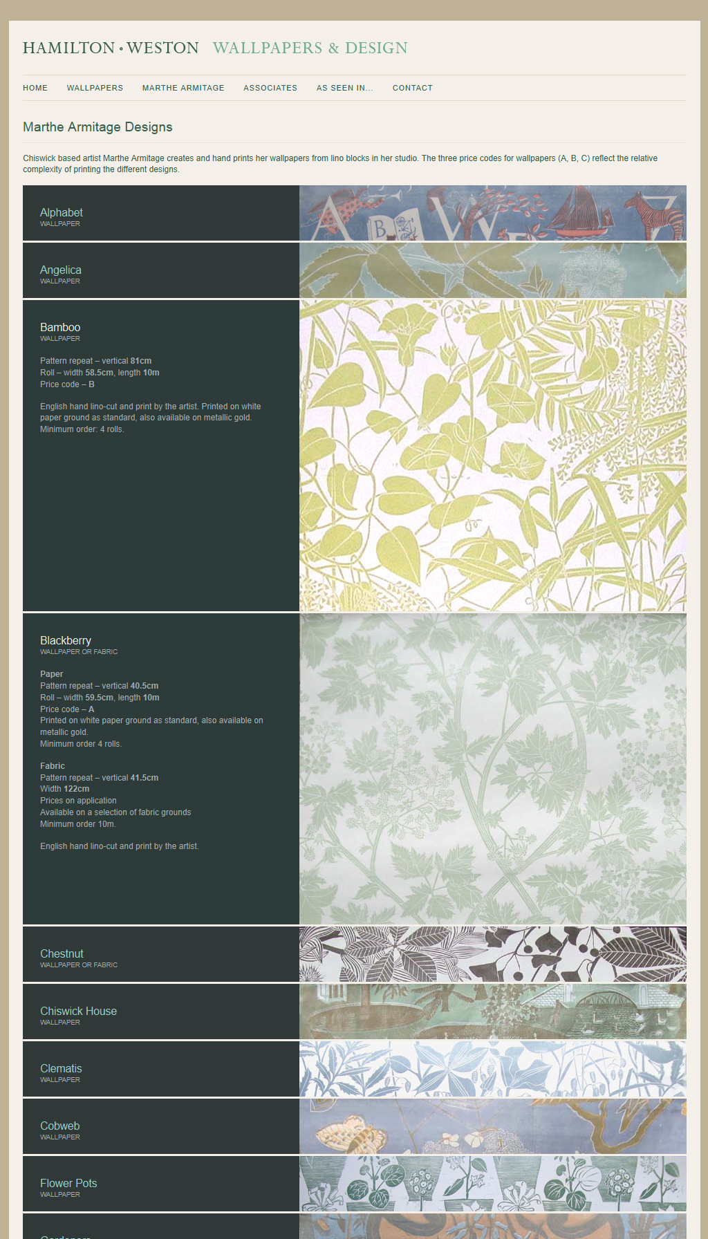
We set ourselves a simple, central task: create the most user-friendly, intuitive and compelling way of browsing the wallpapers. We looked at many competitors’ sites, and sites from similar industries, and in every case felt we could do better. Importantly, we felt that one fundamental requirement of any such browsing system was the ability to compare different papers easily, and that the conventional and ubiquitous way of presenting them (an index page of thumbnails, each linked to a subpage with a larger image and more info) totally fails to achieve this, because it forces you into a laborious cycle of clicking back and forth between index and detail pages, and yet without ever seeing more than one paper on the same page. Neither do small thumbnails – of the size typically seen – particularly glorify their subjects. So, our twin objectives: show large previews, and at the same time devise a much quicker and friendlier system for comparing the papers.
The inspiration
We were developing the site at a time when interactive effects such as animations, fades and overlays were becoming increasingly popular, and an obvious and familiar solution to the clicking back and forth would be to present the papers in a ‘lightbox’-style overlay instead of forcing the user to load a new page in the browser, but we developed what we thought was a better solution. Inspired perhaps by paint swatches, but perhaps more by those poster-browsing racks in the shops, which allow you to see a peek of each design at a glance, yet quickly and easily open at any place to see the full design, we turned the paradigm round 90 degrees – to fit in with the familiar top-down scrolling of the web browsing experience, and came up with an interface which we felt solved all the problems and met all the requirements.
The solution
So, a whole range is presented on a single page – no clicking back and forth. Each paper is presented as a horizontal strip showing a detail – more than you’d see on a traditional thumbnail view. The wallpapers are all stacked one on top of each other on the page – easy browsing back and forth using familiar scrolling. And, most importantly of all – just like those poster viewers in the shops, and thanks the magic of some up-to-date programming techniques – you can see each full design instantly and straightforwardly: clicking on it enlarges the containing strip, showing the larger image as well as relevant details about the papers. It scrolls smoothly to the centre of the screen (which means you can leave the mouse in the same place on the screen and view all the full papers one by one); clicking it again slides the paper away.
Making it even better
As an extra flourish we included an further feature allowing you to see an illustrated mockup of how the wallpaper might look in context, once again making use of the same techniques to have it appear and disappear smoothly and again without forcing the user onto another page. Once you’ve opened a particular paper, clicking the relevant button slides this illustration smoothly out over the large image of the paper; clicking again makes it go away.
Easy content-management
The site was created as a custom WordPress theme allowing straightforward management of all content – including the wallpapers. Adding a new paper is as simple as pasting in its details, ticking a few boxes (range, type, etc), uploading the image and pressing publish.