The brief
We had worked with Lucy Stylianou before when she was with Furnace Productions; when she decided to start her own TV and multimedia production company, Optimago Media, we were naturally pleased that she contacted us again to help with the branding and website. Our two-part brief was simple: firstly, create a logo that fitted the meaning of the name (in latinate: “the best image”) and the multifaceted nature of the new company, and secondly, design and build a website that was initially simple and quick, yet able to scale as Optimago’s portfolio and needs grew. The one other factor we were asked to take into consideration was that Optimago was a name that Lucy was “inheriting” from, or revitalising in honour of her mother’s well-respected handmade jigsaw puzzle company. Although Lucy didn’t want a direct reference to the roots of the name, it was important that whatever we did bore in mind where the name originated.
What we did
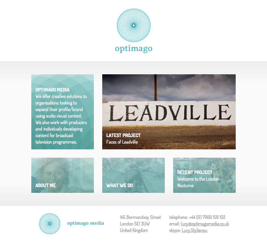
Unusually, it happened very fast. Somewhere in the first hour of playing around with ideas, four versions of a logo concept seemed to spring fully-formed out of Illustrator and fit the Optimago brief closely – rectangles that were representing the various screens of Optimago’s multimedia approach became circles, were rotated and duplicated, and the result looked like an “O”, a spy-hole, a lens, a jewel, a puzzle… and a renaissance piazza (well, specifically, like Piazza del Campidoglio in Rome). Reversing the circles from outlined to filled in and multiplying the very pale, translucent aquamarine fill colour created a beautiful texture to use in other parts of the Optimago identity. The font was easy to pick too – Averia Sans was made by Dan Sayers, who overlaid and averaged all the fonts on his system to create its hard-to-pin-down style, somewhere between formal and distressed, modern and ancient.
When it came to the website, it was a bit of a ‘chicken/egg’, or rather, ‘content/design’ dilemma – what were we actually designing the website to communicate? It was hard for Optimago to envisage the content of their site until they’d seen a design, and hard for us to design it without having seen any content. So we went for a simple, but easily extensible, 16:9 grid of differently sized boxes that could contain project videos, images, slideshows or text. And the logo’s jewel pattern became an overlay that gave the whole an identity, but then faded out to prioritise the content. Rather than build a single page temporary site, we went straight for a WordPress-managed structure that wouldn’t need much of an overhaul as the company grew.