The brief
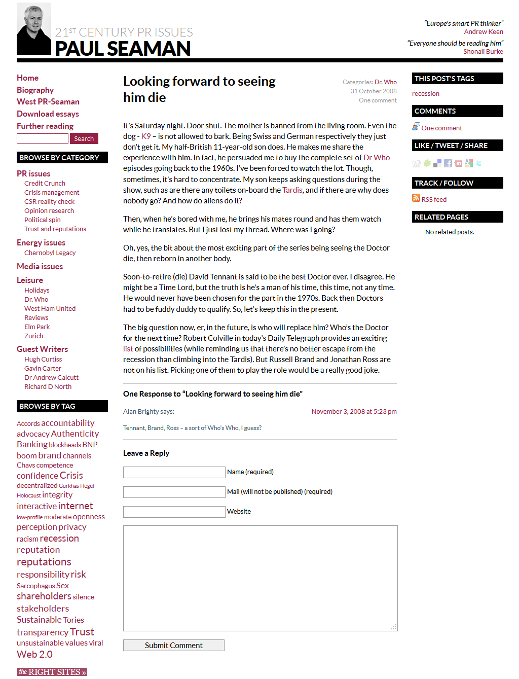
We’d worked with Paul since designing the first version of his website in 2008. He’s posted prolifically and diversely on the site ever since, at times writing extensive, essay-length commentaries. Given that the longer of these pieces might take 20-30 minutes to read, he approached us to turn a selection into print-ready downloadable essays. This naturally led to the development of a new overall image and style for both the website and the print material, in line with Paul’s aspirations to consolidate his position as a bold and forthright voice in world of PR commentary. In Paul’s own words: “I want to come across more authoritative bold and confident, based on my online review’s record and content and reputation”.
What we did
New aesthetic
Starting with the essays, we worked on a new aesthetic reflecting the tone Paul was aiming for. We laid out ten downloadable PDF essays – also sourcing all illustrative imagery – using a minimalist, typography-centric style in red, white and black. The essays came first in InDesign, with many decisions taken to ensure that home-printing would produce good results without excessive ink use.
Applying it to the website
Once the essays were complete, Paul asked us to use the new aesthetic as a springboard for reskinning the website too. We were able to do this without changing the fundamental structure, layout or functionality of the site (since Paul was very happy with these worked). And since the site was already based on an installation of WordPress, we could alter the design without having to reinsert any content. So, all in all it was a relatively quick and painless process.
Typography
In choosing the font for both web and print, we were careful to pick something that was legible, characterful yet neutral enough to convey Paul’s bold, no-nonsense approach, available in a wide range of weights and styles, and supplied as a well-defined font both for web use and for print.
Sourcing images
Almost all of the imagery was sourced from Creative Commons sources such as Wikimedia Commons and Flickr, to keep production costs down.