The brief
After more than 18 months of dreams, discussions and finally hard slog, in March 2011 editor Dan Crowe (formerly of Zembla, Another Magazine) and art directors Matt Willey (Studio8, ex-Vince Frost) and Kuchar Swara (Winkcreative) launched their new independent men’s magazine, whose slogan (at least for the launch issue) was: the Intelligent Magazine for Men. Despite the difficult climate in the industry, it was always to be a print magazine only, its creators sticking to their firm conviction that despite the turbulence, there is still an appetite for the unique qualities of print journalism, and will be for the foreseeable future.
So the magazine content would not be published online, but all the same the editors were not blind to the possibilities offered by digital media. They would still need a website, both as a way of promoting the print product, with appropriate use of social networking tools, and as a companion to the website, providing a place where content which by its very nature can’t be printed – especially video and audio – could be exhibited.
What we did
Nailing the concept and the emphasis
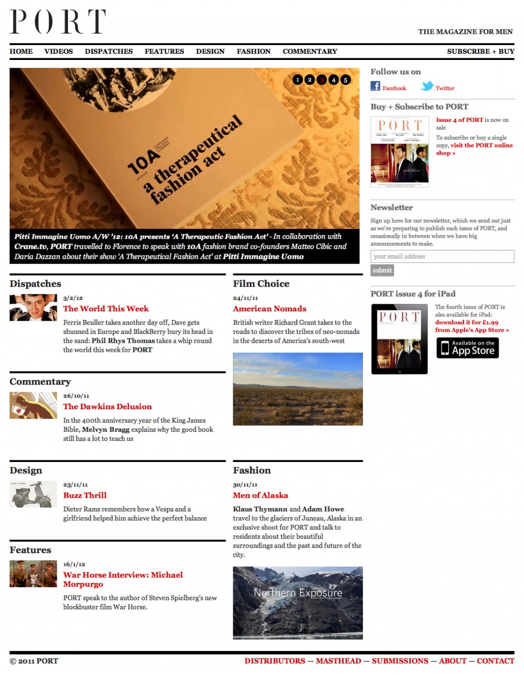
We presented two design concepts for the site: one based closely on the magazine’s design (using its bespoke typefaces and colours), another much more minimal and simplistic. In most cases we try to distil our initial proposal down to the single concept which convinces us most, but the specific requirements in this case – that the website be a companion to the PORT, strong and distinctive yet never the principal focus – led us to this comparison between two approaches, and we decided to present both in order to involve the editors and art directors in this debate.
What they chose and why
Dan, Matt and Kuchar opted for the more minimal of these approaches, following the argument that the print magazine must be the limelight product: if the website tried to follow its design too closely, that would perhaps give it too much prominence, or too much of an independent identity. The stark, black and white design would also provide a usefully neutral frame for the content, which in theory would be predominantly graphical, audio and video.
Responsive layout, maximum impact
In order to maximise the impact of the visual content – both photographic and video – we decided to make the layout responsive to the size of the user’s browser / screen, so that, on much large screens, photos and videos could fill all the available space: a perfect opportunity to buck the long trend of fixing a website’s width. One of the original reasons for that trend was to stop columns of text becoming unreadably wide, but modern web design techniques mean we can limit text size while allowing the visual elements to adapt freely to the available space.
An ongoing collaboration
We have continued to adapt the site since launch, keeping a close eye on content and joining in discussion on its organisation and presentation, adding new sections such as the Agenda, new features such as the ‘lightbox’-style slideshow view available on photo galleries (eg. on the I Love Lamp feature), and making frequent small adjustments, always working closely with PORT’s editorial and design teams.
Shopify
In addition to the main site, we also adapted PORT’s aesthetic into customised Shopify templates for their e-commerce subscriptions storefront.