The brief
The Commission on Living Standards is a major investigation undertaken by UK think-tank the Resolution Foundation into the financial pressures facing low to middle income Britain. In 2011 we designed the Commission’s website, which presented key data, publications and interactive charts. The Commission’s work concludes in 2012 with a comprehensive printed report, entitled ‘Gaining from Growth’, which they asked us to design following the success of the website. Given the significance of their findings and recommendations, it was decided that the report should be made available to as many people as possible, across as many different media and formats as possible: the centrepiece was to be a B5-size printed book, but special versions of the report were also required for home-printing (in A4), for the iPad and Kindle, and also for the web.
What we did
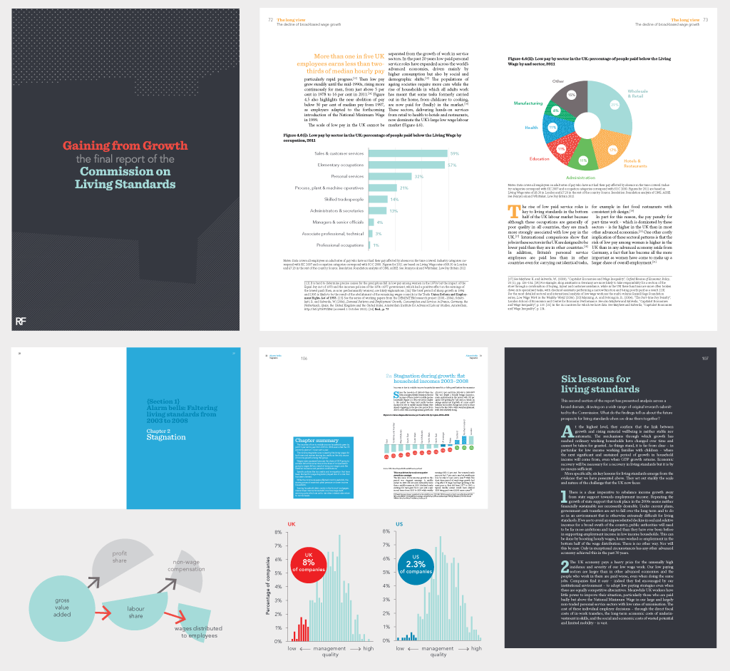
In our first meeting, we talked about the fundamental goals for the report design, which were to help transmit the Commission’s findings clearly to a broad readership of journalists, economists, politicians, policy makers and members of the public – each with their own requirements and, arguably, time availability and attention span. Analysing the publications of other think-tanks, which tended towards a dry, linear (and less than eye-catching) presentation, we suggested and discussed various ways of breaking out key themes and information that would be of interest to the readership groups, drawing inspiration for our solutions both from more eye-catching magazine design and from our work on the web.
Other decisions revolved around the extent to which the report’s design should echo the pre-existing website, or the Resolution Foundation’s own corporate image. We iterated ideas, fonts and colours and reached agreement on an overall concept, which nodded to the Commission on Living Standards site but also had its own distinctive identity, with elegant typography that prioritised legibility and “scan-ability”, bright colours to code the report’s main sections, box-outs to section off lateral content and chapter summaries and pull-quotes to draw attention to the key messages of the report.
The majority of the report design work was completed in a very short period of time: there were only ten days between receiving the signed-off 150-page final draft and the print deadline. Knowing that the work was going to be fast and furious, we had already enlisted Ben Dakin, a friend and experienced magazine and print designer with a mean eye for poorly-tracked letter pairs and muscle memory for every InDesign shortcut, to work with us on the report.
We set about getting the report from Word into the flexible grid and careful hierarchy of styles Ben had set up in InDesign based on our initial layout draft, and imported all of the original Excel charts into Illustrator for some heavy-duty “prettifying”, making colours and textures, fonts, sizes and styles uniform across all 60 line, bar, scatter and pie charts. We worked in-house at Resolution Foundation’s offices during the final intense days and evenings, and despite the hefty workload the report went to the printers and was delivered on time.
Once it had gone to print we spent another week producing the extra formats: special PDFs reflowed at A4 and iPad size (with hyperlinks and an interactive table of contents), and a completely reformatted version for Kindle.
Feedback
“Amazing job on the design. You made the impenetrable attractive”
Vidhya Alakeson, Deputy Chief Executive of Resolution Foundation
Press coverage
With the launch of the report, The Commission on Living Standards has been getting vast amounts of media attention and press coverage. Here are some of the places we’ve seen the report discussed so far: